Be yourself; Everyone else is already taken.
— Oscar Wilde.
This is the first post on my new blog. I’m just getting this new blog going, so stay tuned for more. Subscribe below to get notified when I post new updates.
Be yourself; Everyone else is already taken.
— Oscar Wilde.
This is the first post on my new blog. I’m just getting this new blog going, so stay tuned for more. Subscribe below to get notified when I post new updates.
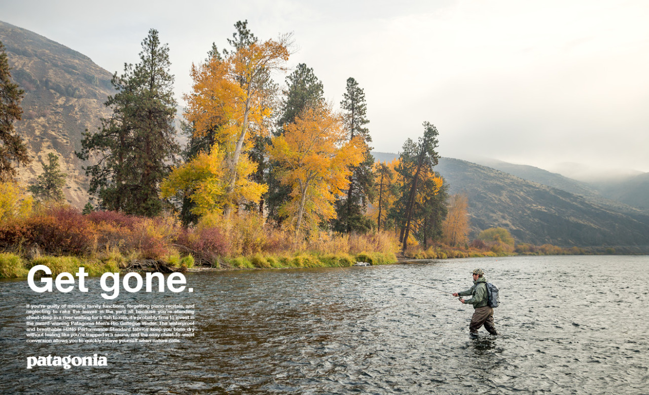

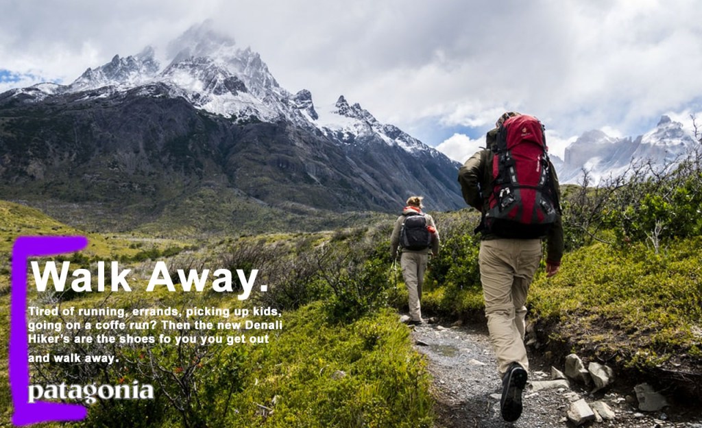
This ad is from the company Patagonia. They make high quality outdoor gear, clothing, and equipment. I found the image to this ad at https://www.google.com/url?sa=i&url=https%3A%2F%2Fwww.pinterest.com%2Fpin%2F342344009163254326%2F&psig=AOvVaw0M4YkxEld4AuRXZDMp4FDG&ust=1584823933322000&source=images&cd=vfe&ved=0CAIQjRxqFwoTCNDG07D3qegCFQAAAAAdAAAAABAD.
DESIGN
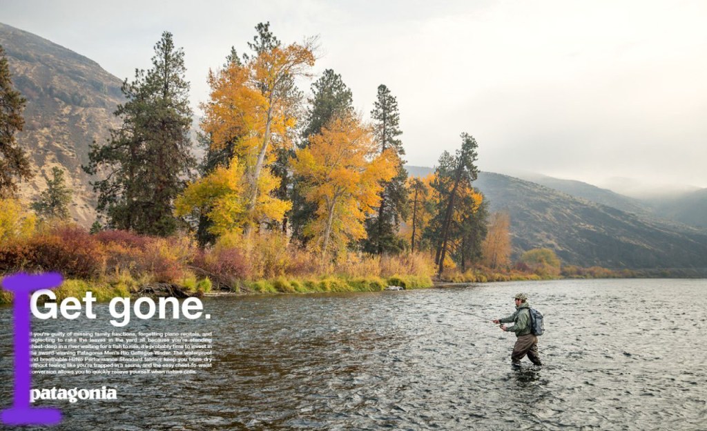
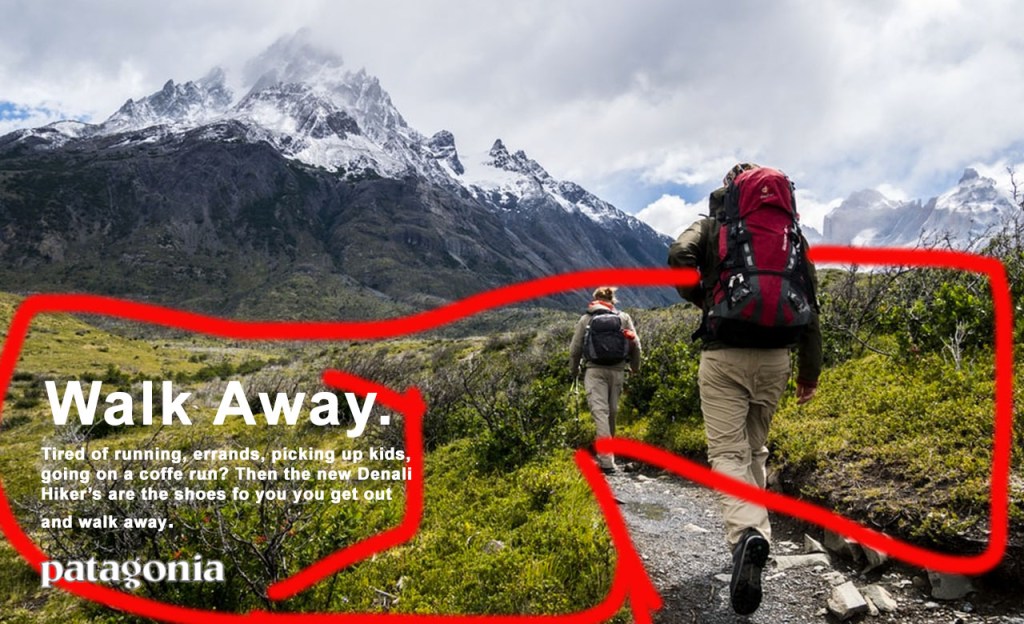
In this draw over above, I have highlighted the alignment that is present in this ad. I have chose to highlight this in purple. You can see that the text of the ad is all aligned on the left side. This helps the design of the ad to be uniform in helping the viewer read the text.
COLOR
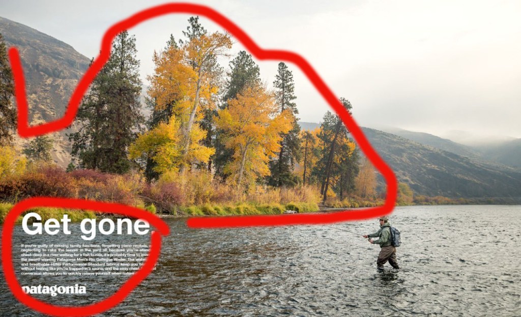
In this draw over, I’m pointing out the use of color in this original ad. We can see that most of the colors on the image are natural, earthy tones. The color of the trees, bushes and grass on the shore contrast nicely and stand out with the lighter yellows, reds, and greens. The white text also is more present helping to draw your eyes to it as well.
TYPOGRAPHY
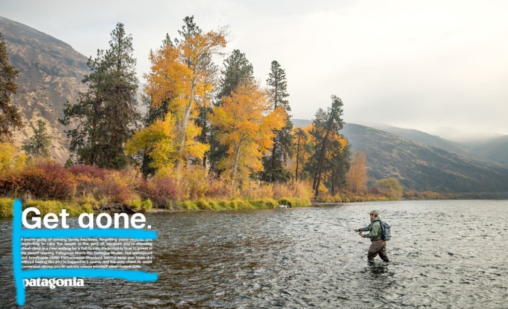
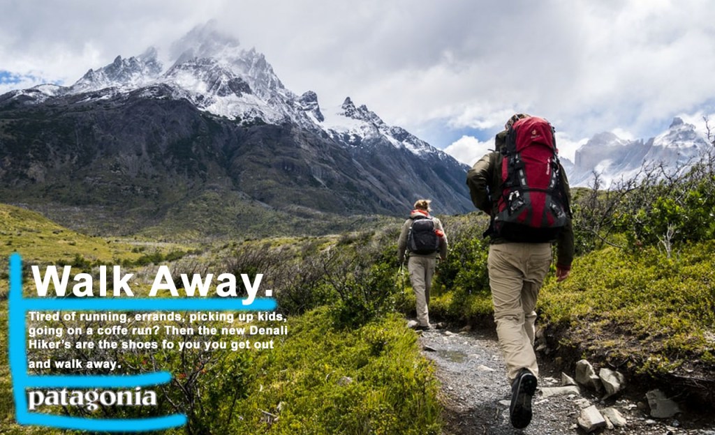
In this drawer over, I am highlighting the typography used in the original ad. I have used a light blue to highlight the typography in the lower left corner. We can see that they used larger font sizing for the top tagline “Get gone”, and smaller font size for the body text. Both of these are done in the same font type. They are all aligned and have even spacing between text sections.
DESIGN
In the above draw over of the new ad, I am highlighting how alignment is used in this ad’s design, and relates to the original ad.In this new ad, I have highlighted in purple how the text is all aligned on the left side. This is consistent with the original ad’s left side text alignment.
COLOR
Here, I want to illustrate how this ad makes use of color. I have used red to highlight how this ad makes good use of color and is similar to the original ad. Most of the brighter color is found in the foreground with the brighter green of the grass. This stands out against the darker mountain, just like the grass in the original ad stood out against the river. The white text also contrasts well against the earth toned background colors.
TYPOGRAPHY
Above, I’ve illustrated the new ad’s use of typography. I’ve used blue to highlight this. We can see that this new ad’s typography fits the same style as the original, so as too make it look like its from the same campaign. The same font style is used for both the body text and the tagline at the top. there is even spacing as well. Similar font sizes are used for both the original ad and the new one, and they are aligned on the left. The same logo is used as well at the bottom.
CONCLUSION
In doing these various draw overs, I hope that you can see the well used design, color, and typography attributes of the original design. Also, that the new design made uses those same features, such as alignment, earth tone colors, and consistency in typography. This is used to make the new ad look as if it is from the same campaign as the original ad.
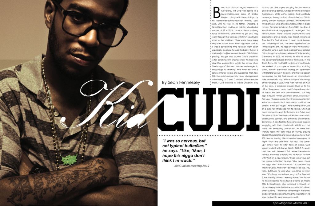
The purpose of this blog post is to show how the above magazine spread represents a good use of typeface & photography. This photo is of musical artist Kid Cudi, and the article is by Sean Fennessey, and this is the link for where I found the spread . I will point out how it uses different typeface categories, contrast in the typefaces, and how the photograph uses the rule of thirds.
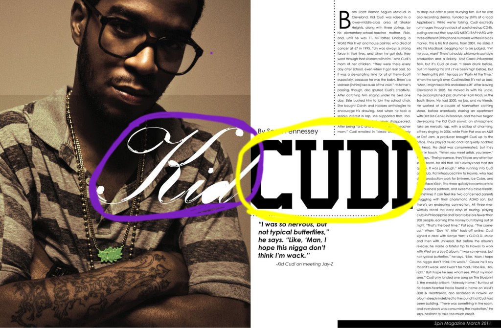
In the above image, we can see that multiple categories in typography are being used. In purple, I have circled a typeface in the category of Formal Script. In yellow, I have circled a typeface in the category of Serif, specifically Slab Serif.
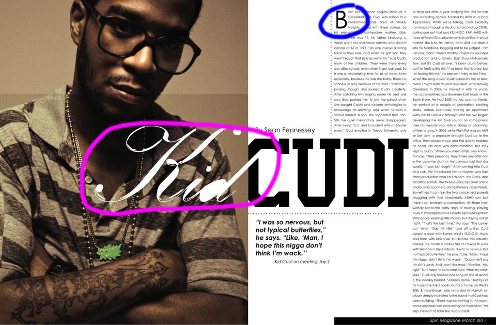
In this next image that is pictured above, the contrast that is present between the typefaces. I have highlighted in pink and blue how different factors of these two typefaces are contrasting. We can see that stokes of the lines in the type that is circled in pink is not very clean, and looks kind of calligraphic. We can see that there are larger swoops in the ends of the letters and strokes that connect letters. In blue I have highlighted how the other type face is of the body, and is Sans Serif. These lines have no serif, and help to distinguish the title from the body of the article.
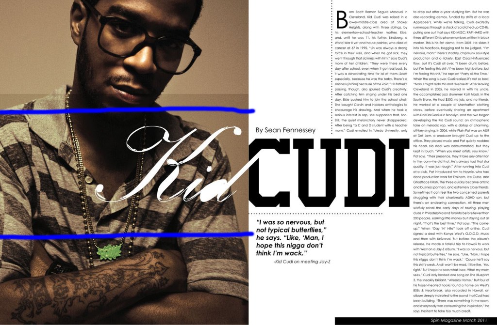
In this image above, I have pointed to how the photograph in this magazine spread shows the “Rule of Thirds”. With blue lines, I have separated the photo into thirds. This image uses this rule of thirds well by having the focal point of the subject’s face being in the upper third of the photo, and the rest of the body being in the bottom two-thirds.
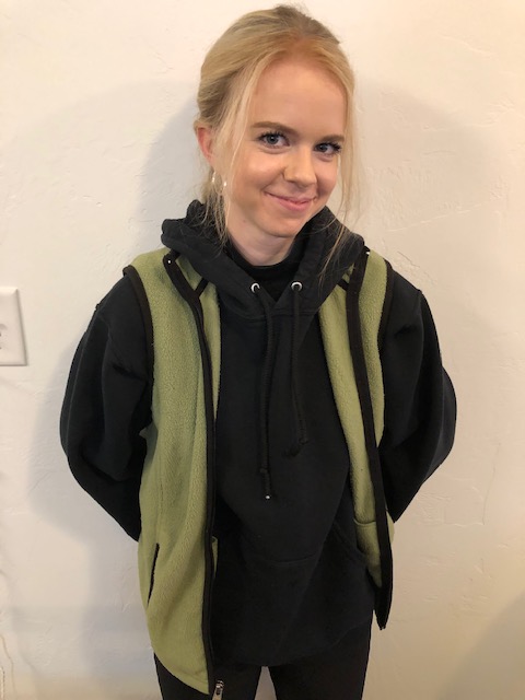
Below are three images that I took myself. Each of these images is to mimic the principle of the “rule of thirds” that is used in the original photograph.


The principles above of using different types of typography and the contrast in the different styles used, as well as the the use of photography helps to create a string visual image for this magazine spread. These principles help to make the spread visually appealing to the reader.

The ad seen here that I have chosen to use is a vintage Nike running ad from 1986 (see below). This ad by Nike was used to promote some of their newly released running shoes. In this blogpost, I will use this classic ad in demonstrating 5 design principles in advertisement, those being alignment, contrast, proximity, and repetition, and color.

Above is what the original 1986 Nike Ad looks like. In the image below I made marks to show the alignment that is present in the ad. You can see from the red lines that I have marked on it, how the four shoes on top are all aligned. The upper left shoe is aligned on its bottom with the shoe to the right of it. It is also signed at the heel and toe with the one below it. This is the same for the bottom row of shoes.
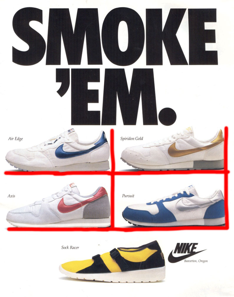
Here below, I have pointed out how contrast is demonstrated throughout the ad. I have circled in red the words at the top, “Smoke Em”. These words are large, bolded, capitalized, and dark black. This helps it stand out in contrast to the white background. I have also circled the “swooshes”, or nike logos on the side of the the four white shoes. They are each colored and stand out against predominately white shoes and a white background. Also the show at the bottom is circled and is very contrasting. It is a bright yellow color, versus the other four on top that are mostly white. The Nike logo to the side of the yellow shoe also sticks out with the bold black against the white background.
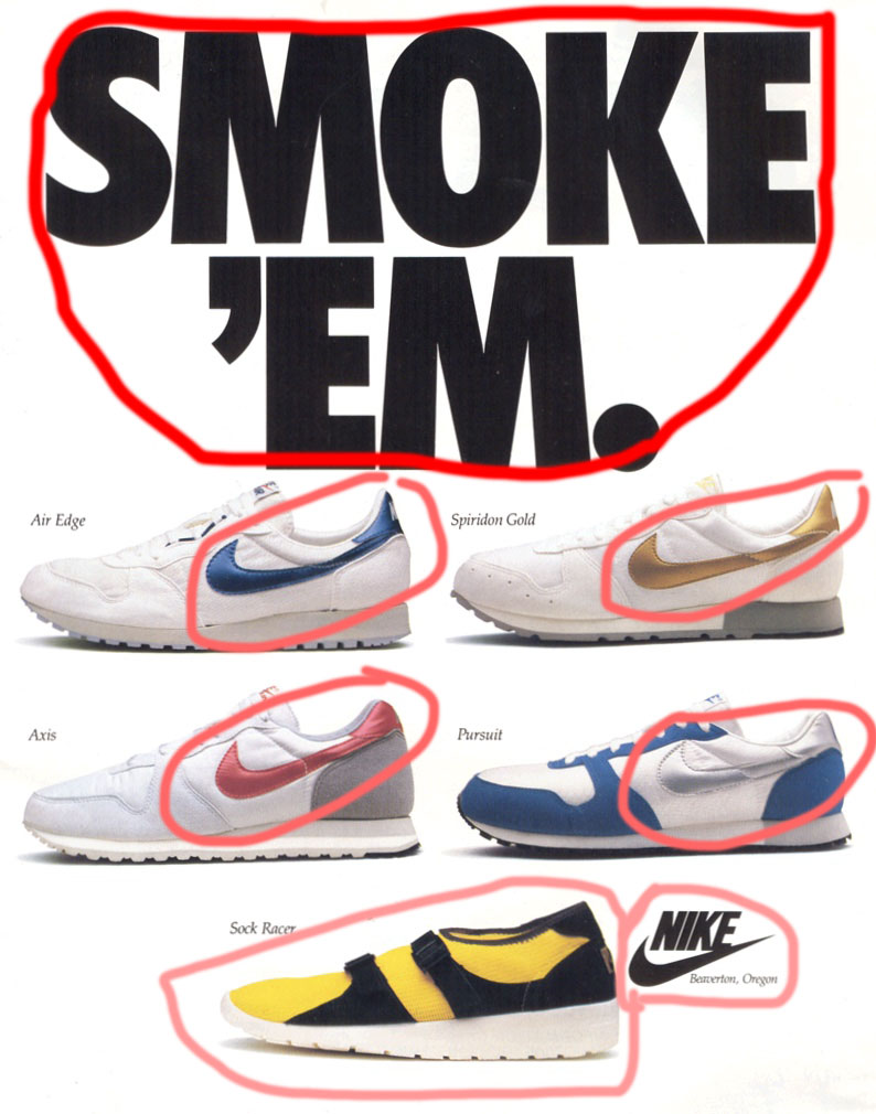
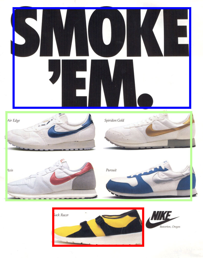
The next image seen below demonstrates the proximity that is present in the ad. We can see starting from the top how the main slogan, “Smoke ‘Em”, is outlined in blue. We can tell this is one slogan because of the words closeness in proximity. I outlined the group of shoes in green. The shoes are souped together with a good proximity to one another. The bottom red outline is showing the proximty of the shoe with the shoe name, the shoe name being right above and to the right of shoe.
To demonstrate the repetition principle that is present in this ad I have pointed out a few different things. First we can see how the slogan at the top is in the same font and boldness on both lines. I’ve shown that by underlining that in red. Also we can see repletion in the shoes, and the way that they are each facing. Each of the shoes has its toe pointing to the left, which I have pointed out using a leftward pointing arrow. Another example of repletion in the ad is with the shoe names, as well as where it says, “Beaverton, Oregon”. Ive underline these words in blue, and they show repetition because they are in the same font and size, and they each seem to be italicized.

Lastly, I want to point out the use of color, and its effect in the advertisement. The image is mainly white. The background is white and the shoes are mostly white. This helps in focusing the viewer’s eyes, starting at the top with the slogan with is black. I have put a blue box around the slogan. Then the four shoes below I have underlined the swooshes in purple. The colors of these swooshes are more so that the background, but the red and blue and gold are a little dull at the same time. The bottom shoe is a bright yellow color, which I have outlined in green. This helps to create a sense of vibrancy and draws the eye to this shoe.

This vintage Nike Ad, along with others from their brand are well known and iconic because of the different design principles that are well applied within the ads. It has been demonstrated here how alignment, contrast, proximity, and repetition, and color help to make an ad effective to its viewer. This type of advertising has helped promote Nikes equipment into the well recognizable consumer products that they are today.
This is an example post, originally published as part of Blogging University. Enroll in one of our ten programs, and start your blog right.
You’re going to publish a post today. Don’t worry about how your blog looks. Don’t worry if you haven’t given it a name yet, or you’re feeling overwhelmed. Just click the “New Post” button, and tell us why you’re here.
Why do this?
The post can be short or long, a personal intro to your life or a bloggy mission statement, a manifesto for the future or a simple outline of your the types of things you hope to publish.
To help you get started, here are a few questions:
You’re not locked into any of this; one of the wonderful things about blogs is how they constantly evolve as we learn, grow, and interact with one another — but it’s good to know where and why you started, and articulating your goals may just give you a few other post ideas.
Can’t think how to get started? Just write the first thing that pops into your head. Anne Lamott, author of a book on writing we love, says that you need to give yourself permission to write a “crappy first draft”. Anne makes a great point — just start writing, and worry about editing it later.
When you’re ready to publish, give your post three to five tags that describe your blog’s focus — writing, photography, fiction, parenting, food, cars, movies, sports, whatever. These tags will help others who care about your topics find you in the Reader. Make sure one of the tags is “zerotohero,” so other new bloggers can find you, too.
