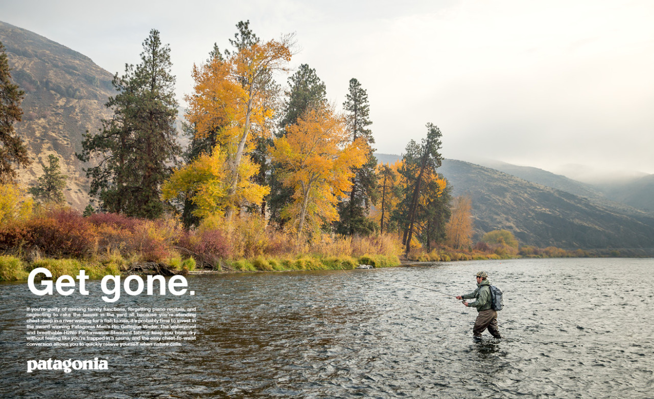

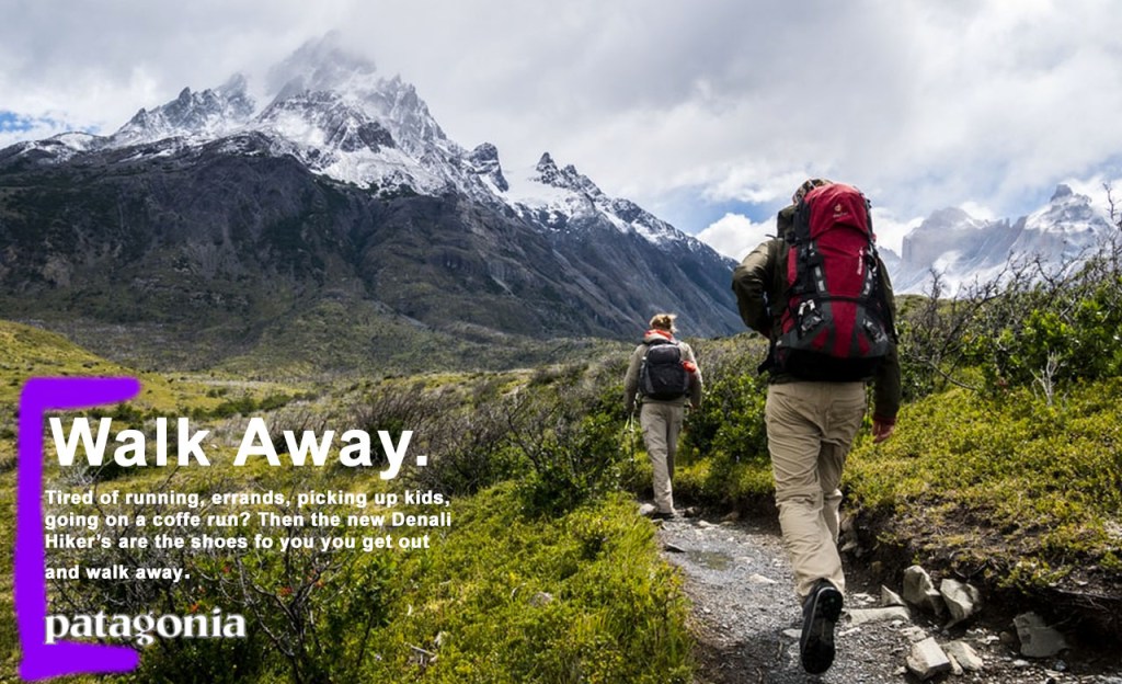
This ad is from the company Patagonia. They make high quality outdoor gear, clothing, and equipment. I found the image to this ad at https://www.google.com/url?sa=i&url=https%3A%2F%2Fwww.pinterest.com%2Fpin%2F342344009163254326%2F&psig=AOvVaw0M4YkxEld4AuRXZDMp4FDG&ust=1584823933322000&source=images&cd=vfe&ved=0CAIQjRxqFwoTCNDG07D3qegCFQAAAAAdAAAAABAD.
Original Ad Analysis
DESIGN
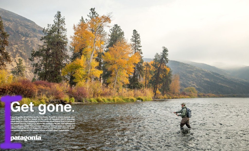
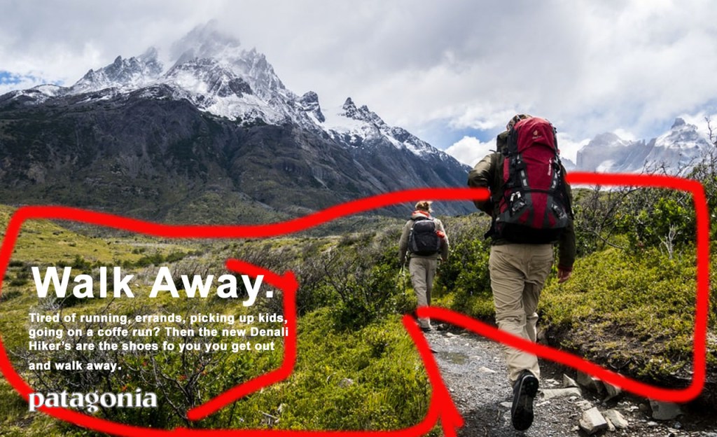
In this draw over above, I have highlighted the alignment that is present in this ad. I have chose to highlight this in purple. You can see that the text of the ad is all aligned on the left side. This helps the design of the ad to be uniform in helping the viewer read the text.
COLOR
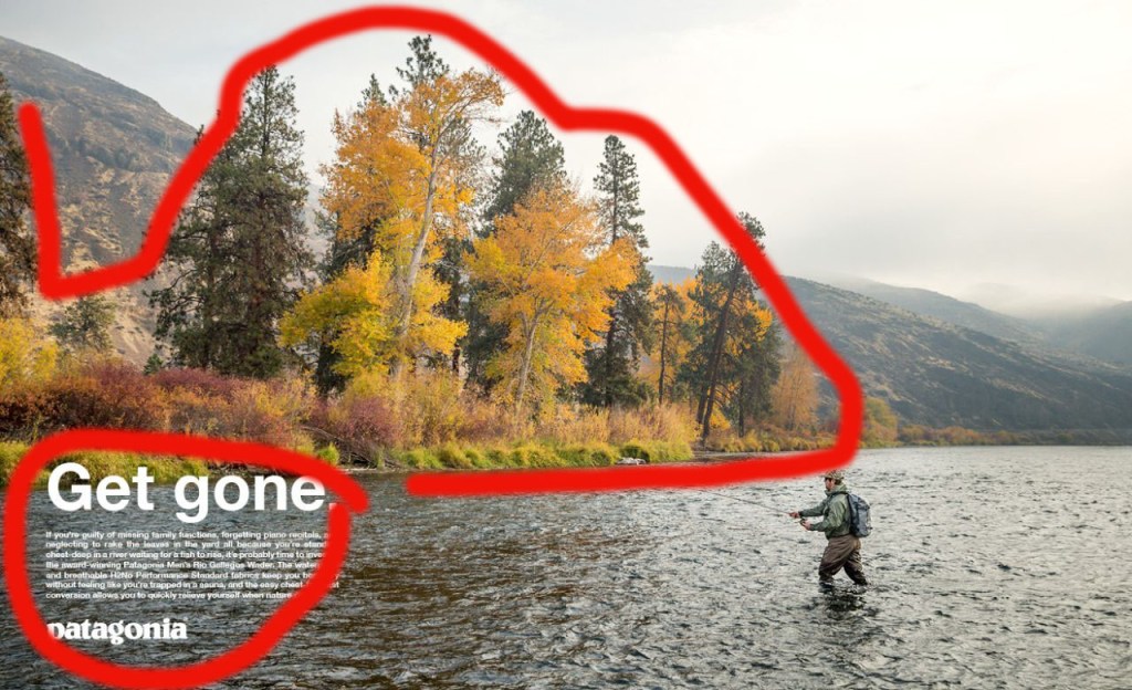
In this draw over, I’m pointing out the use of color in this original ad. We can see that most of the colors on the image are natural, earthy tones. The color of the trees, bushes and grass on the shore contrast nicely and stand out with the lighter yellows, reds, and greens. The white text also is more present helping to draw your eyes to it as well.
TYPOGRAPHY
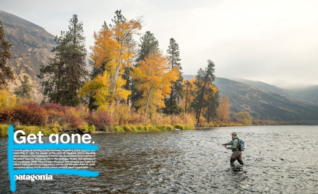
In this drawer over, I am highlighting the typography used in the original ad. I have used a light blue to highlight the typography in the lower left corner. We can see that they used larger font sizing for the top tagline “Get gone”, and smaller font size for the body text. Both of these are done in the same font type. They are all aligned and have even spacing between text sections.
New Ad Analysis
DESIGN
In the above draw over of the new ad, I am highlighting how alignment is used in this ad’s design, and relates to the original ad.In this new ad, I have highlighted in purple how the text is all aligned on the left side. This is consistent with the original ad’s left side text alignment.
COLOR
Here, I want to illustrate how this ad makes use of color. I have used red to highlight how this ad makes good use of color and is similar to the original ad. Most of the brighter color is found in the foreground with the brighter green of the grass. This stands out against the darker mountain, just like the grass in the original ad stood out against the river. The white text also contrasts well against the earth toned background colors.
TYPOGRAPHY
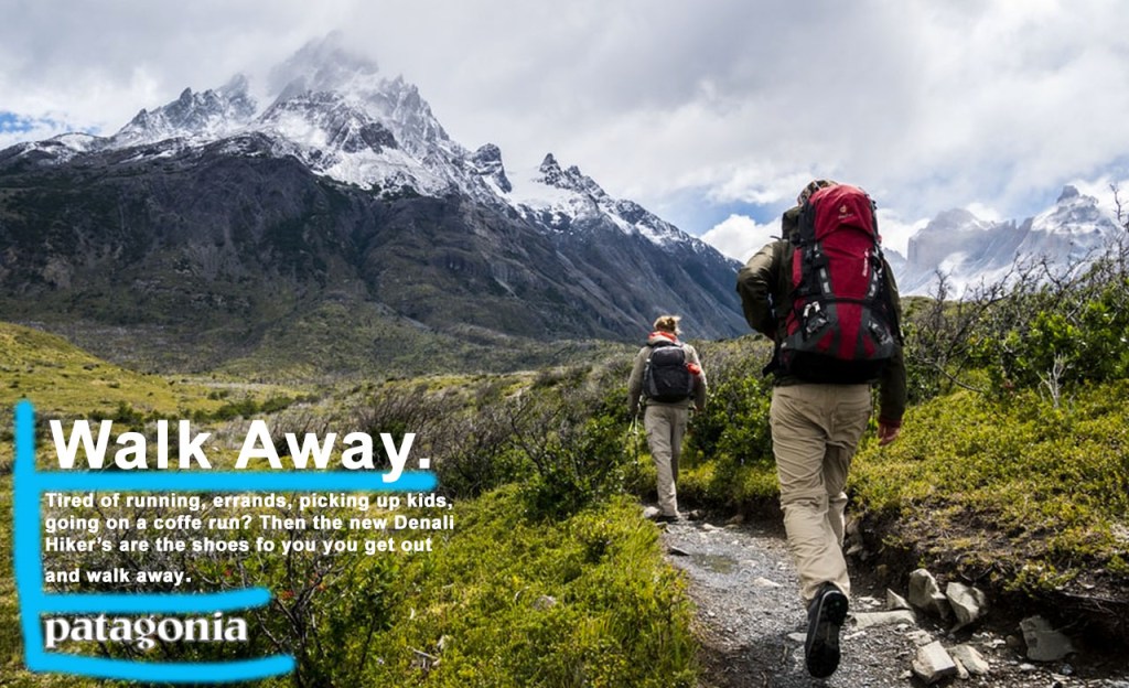
Above, I’ve illustrated the new ad’s use of typography. I’ve used blue to highlight this. We can see that this new ad’s typography fits the same style as the original, so as too make it look like its from the same campaign. The same font style is used for both the body text and the tagline at the top. there is even spacing as well. Similar font sizes are used for both the original ad and the new one, and they are aligned on the left. The same logo is used as well at the bottom.
CONCLUSION
In doing these various draw overs, I hope that you can see the well used design, color, and typography attributes of the original design. Also, that the new design made uses those same features, such as alignment, earth tone colors, and consistency in typography. This is used to make the new ad look as if it is from the same campaign as the original ad.
