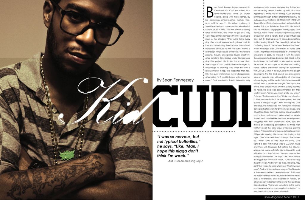
The purpose of this blog post is to show how the above magazine spread represents a good use of typeface & photography. This photo is of musical artist Kid Cudi, and the article is by Sean Fennessey, and this is the link for where I found the spread . I will point out how it uses different typeface categories, contrast in the typefaces, and how the photograph uses the rule of thirds.
TYPE CATEGORY
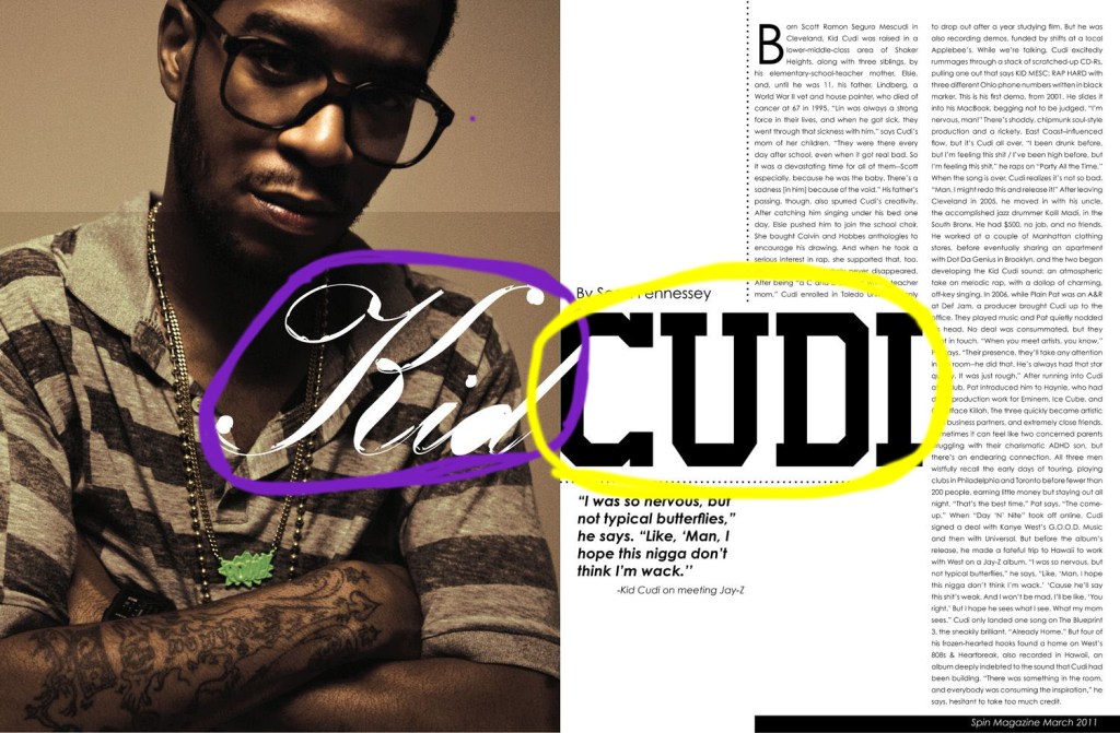
In the above image, we can see that multiple categories in typography are being used. In purple, I have circled a typeface in the category of Formal Script. In yellow, I have circled a typeface in the category of Serif, specifically Slab Serif.
TYPE CONTRAST
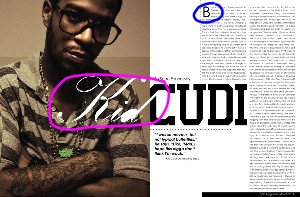
In this next image that is pictured above, the contrast that is present between the typefaces. I have highlighted in pink and blue how different factors of these two typefaces are contrasting. We can see that stokes of the lines in the type that is circled in pink is not very clean, and looks kind of calligraphic. We can see that there are larger swoops in the ends of the letters and strokes that connect letters. In blue I have highlighted how the other type face is of the body, and is Sans Serif. These lines have no serif, and help to distinguish the title from the body of the article.
PHOTOGRAPHY
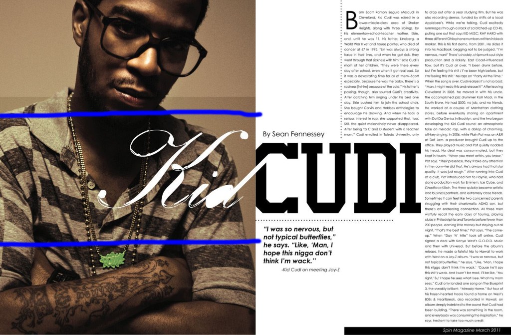
In this image above, I have pointed to how the photograph in this magazine spread shows the “Rule of Thirds”. With blue lines, I have separated the photo into thirds. This image uses this rule of thirds well by having the focal point of the subject’s face being in the upper third of the photo, and the rest of the body being in the bottom two-thirds.
ALTERNATE IMAGES
Below are three images that I took myself. Each of these images is to mimic the principle of the “rule of thirds” that is used in the original photograph.


SUMMARY
The principles above of using different types of typography and the contrast in the different styles used, as well as the the use of photography helps to create a string visual image for this magazine spread. These principles help to make the spread visually appealing to the reader.
