
The ad seen here that I have chosen to use is a vintage Nike running ad from 1986 (see below). This ad by Nike was used to promote some of their newly released running shoes. In this blogpost, I will use this classic ad in demonstrating 5 design principles in advertisement, those being alignment, contrast, proximity, and repetition, and color.

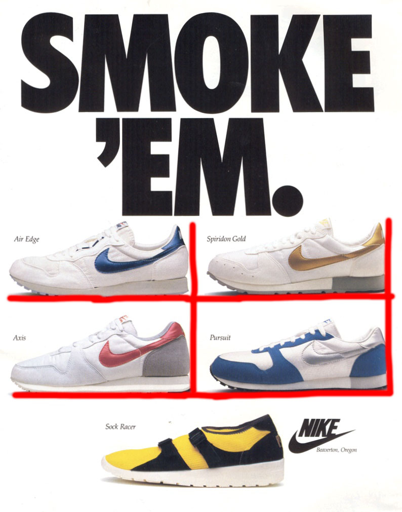
Above is what the original 1986 Nike Ad looks like. In the image below I made marks to show the alignment that is present in the ad. You can see from the red lines that I have marked on it, how the four shoes on top are all aligned. The upper left shoe is aligned on its bottom with the shoe to the right of it. It is also signed at the heel and toe with the one below it. This is the same for the bottom row of shoes.
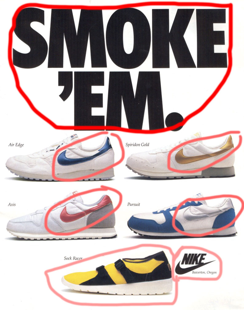
Here below, I have pointed out how contrast is demonstrated throughout the ad. I have circled in red the words at the top, “Smoke Em”. These words are large, bolded, capitalized, and dark black. This helps it stand out in contrast to the white background. I have also circled the “swooshes”, or nike logos on the side of the the four white shoes. They are each colored and stand out against predominately white shoes and a white background. Also the show at the bottom is circled and is very contrasting. It is a bright yellow color, versus the other four on top that are mostly white. The Nike logo to the side of the yellow shoe also sticks out with the bold black against the white background.
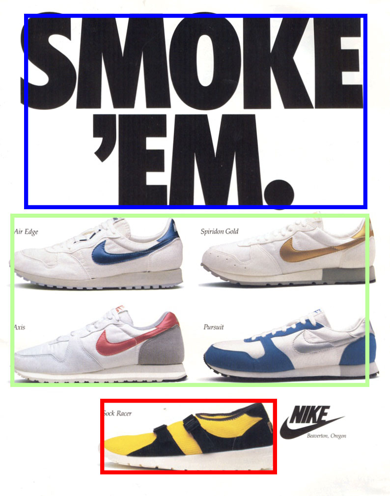
The next image seen below demonstrates the proximity that is present in the ad. We can see starting from the top how the main slogan, “Smoke ‘Em”, is outlined in blue. We can tell this is one slogan because of the words closeness in proximity. I outlined the group of shoes in green. The shoes are souped together with a good proximity to one another. The bottom red outline is showing the proximty of the shoe with the shoe name, the shoe name being right above and to the right of shoe.
To demonstrate the repetition principle that is present in this ad I have pointed out a few different things. First we can see how the slogan at the top is in the same font and boldness on both lines. I’ve shown that by underlining that in red. Also we can see repletion in the shoes, and the way that they are each facing. Each of the shoes has its toe pointing to the left, which I have pointed out using a leftward pointing arrow. Another example of repletion in the ad is with the shoe names, as well as where it says, “Beaverton, Oregon”. Ive underline these words in blue, and they show repetition because they are in the same font and size, and they each seem to be italicized.

Lastly, I want to point out the use of color, and its effect in the advertisement. The image is mainly white. The background is white and the shoes are mostly white. This helps in focusing the viewer’s eyes, starting at the top with the slogan with is black. I have put a blue box around the slogan. Then the four shoes below I have underlined the swooshes in purple. The colors of these swooshes are more so that the background, but the red and blue and gold are a little dull at the same time. The bottom shoe is a bright yellow color, which I have outlined in green. This helps to create a sense of vibrancy and draws the eye to this shoe.

This vintage Nike Ad, along with others from their brand are well known and iconic because of the different design principles that are well applied within the ads. It has been demonstrated here how alignment, contrast, proximity, and repetition, and color help to make an ad effective to its viewer. This type of advertising has helped promote Nikes equipment into the well recognizable consumer products that they are today.
